
Reveloot Games
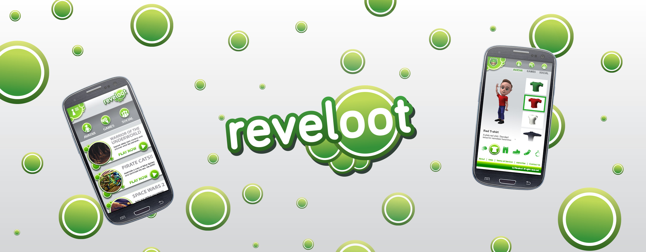
REVELOOT GAME COMPANY
Branding, Mobile Web Design, UX Design
Reveloot is a startup game development company based in New York, working on a new mobile social gaming platform powered by HTML5. The founders tapped me to help them come up with a brand identity as well as design their mobile website on which their games and social network would be hosted.
Note: to comply with my non-disclosure agreement, some materials seen herein have been altered to omit confidential company information.

"Jylted" Beginnings
The company, as their story goes, was founded by a group of developers who had worked together at another studio before all getting hit by a round of layoffs. So when I first came into contact with the company's founders, they were unofficially calling their company "Jylted". Before we did anything else, I asked them what were their goals and intentions for this new website. Their plan was to create a community of registered users and offer free-to-play browser games hosted on their website; no downloads, no installs.
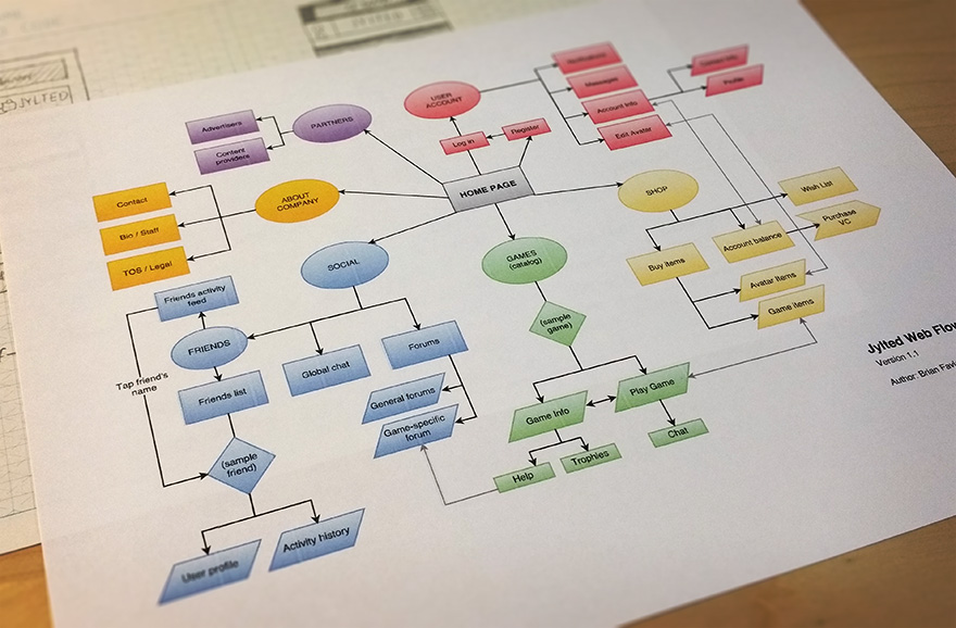
In addition to the games, the owners wanted to push the social aspects of their community and provide user-driven newsfeeds, forums, chat rooms and more. "Jylted" users would create avatars for themselves, and be able to personalize their online personas with clothing and accessories they can purchase through an on-site shop. The company also planned to build revenue streams through ad partners and other content providers. With that information, I began work on mapping out their site's features.
Designing a Mobile Platform
Having a basic plan laid out, I started working on some design ideas for the site itself. Being a mobile-centric platform, the founders emphasized that they wanted the site tailored specifically for smartphones (portrait orientation), so thats what I focused on from the get-go. With the games being the main draw to the site, particularly for new users, I felt it was best to feature the games catalog immediately on the home screen. Before I started sketching, I took a look at other sites featuring in-browser games like MobileWebArcade and GOBOplay to see how they presented their game catalogs.
Frankly, their homepages looked rather cheap and unattractive, being little more than simple grids of icons that gave no information upfront about the games themselves. So I did not get much inspiration from those sites, other than the belief that "Jylted" users deserved a better presentation.
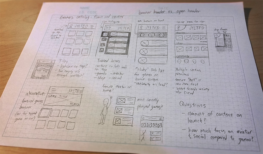
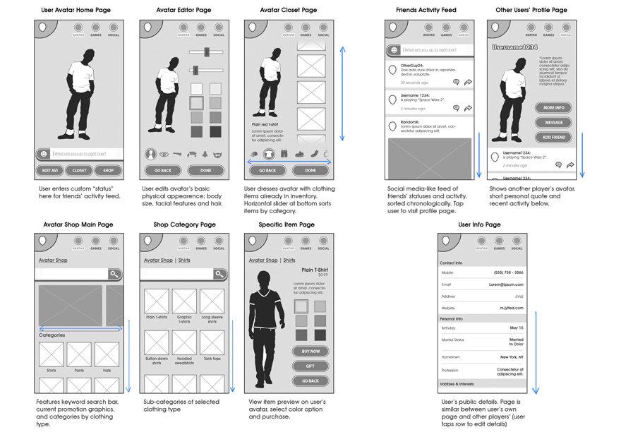
I began with some sketches featuring different layouts for the home screen. As I was brainstorming ideas, one concern came to mind: this is a new startup company with a small development team, so how many games do they intend to have on their platform ready at launch? It was possible that they could partner up with some third-party developers to pad their catalog, but nothing was certain. Therefore I made sure to present some options to make good use of screen real estate on their home page without depending on a large catalog at launch, like more emphasis on their social features and online store.
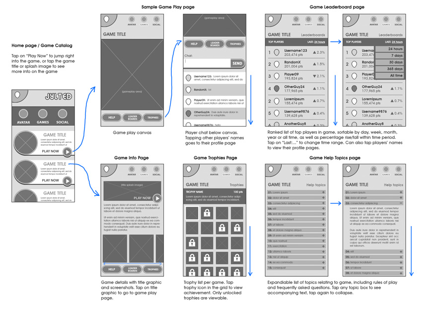
The founders liked various elements from different sketches I presented, like the rounded sliders and the drop-down menu from the top corner. I felt the sliders were a good choice because they presented the games catalog as a single column list with enough room for some descriptive text. They also liked the nav buttons at the top as circles; they called them "bubbles", so I made a mental note of that for branding. However, the team was still split on the header being a common screen-wide banner or something more open, and wanted to see more options utilizing the drop-down menu.

Committing to the rounded sliders for the list of games, I played around with different ideas for the header. Once I worked in the drop-down menu concept, however, it was decided that an open banner felt better. Plus the top corner worked with the "bubble" concept, and so with that I moved forward with that for the other wireframes.
Branding
As I began preparing some high-fidelity mockups, the founders and I began to discuss the company's brand in further detail. During this design phase, they informed me that they had officially changed their company name to one that they felt better accentuated their plans for a new and better mobile gaming platform: "Reveloot". They were excited about the bubble theme for the website's design, and we also agreed to go with a green color scheme, green having positive color associations in most cultures and also being considered the most restful hue to the human eye.
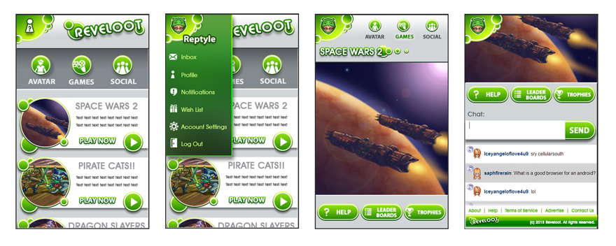
We all agreed the site design was on the right track, but one important element still felt incomplete: the logo. The previous iterations under the name "Jylted" were quickly-made placeholders, but with the company finally settled on a name, I felt it was a good time to shift focus and better flesh out the company's brand. Still committed to the bubble theme, I played around with different arrangements until I came up with something that was universally liked.
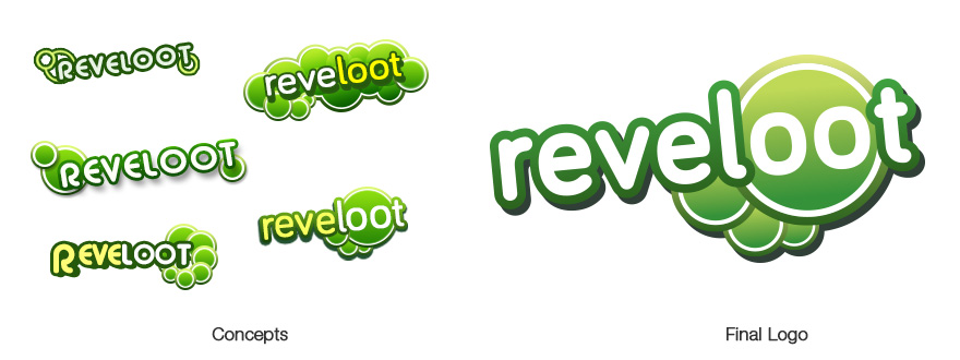
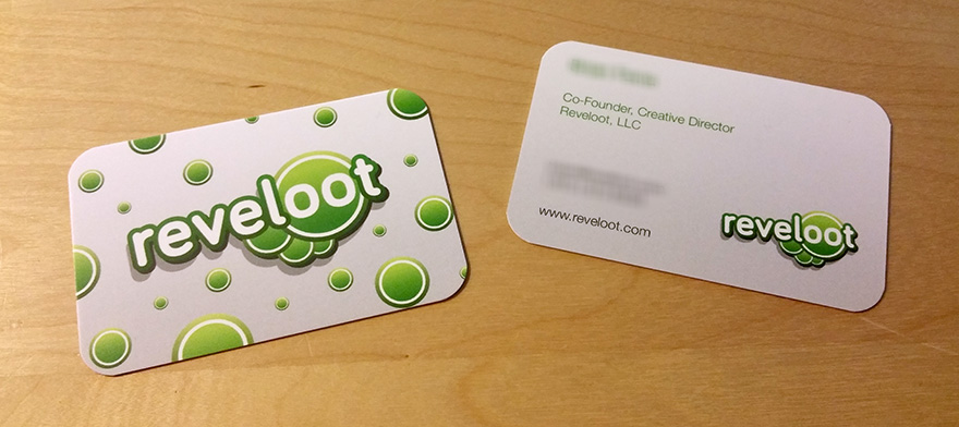
The final logo has two nice things going for it: first, the arrangement of the circles makes the illusion of a thought bubble, highlighting the company's way of thinking differently about mobile gaming. Second, the double "O" over the large bubble resembled a face, which not only adds a human element to the company's branding, but also has great potential as a mascot/icon.

Bringing It All Together
Now that we had a clear direction for Reveloot's branding, it was time to go back and follow through with the rest of the site design. Following some minor refinements to the previous mockups, everything materialized pretty well, with the various sections and sub-pages coming together really nice under the current style.
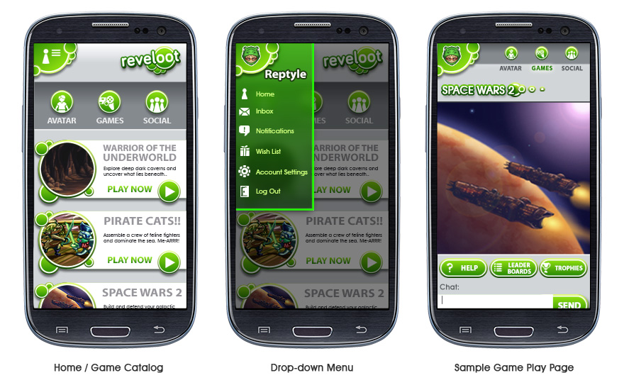
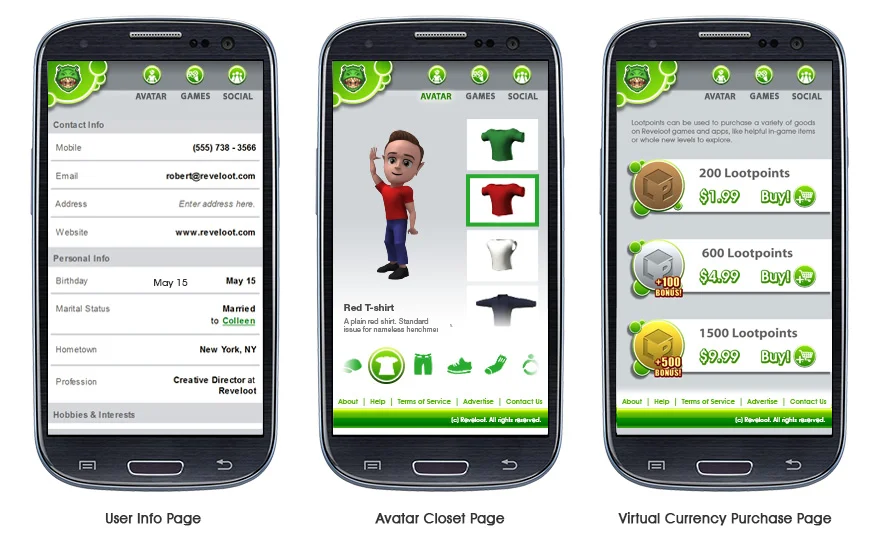
The "closet" page shown above demonstrates how a user can dress up his or her avatar, with a touch-scrolling column sorting the inventory by the selected category in the bottom row. The avatar and inventory items are placeholders in this image, but the layout is there. Meanwhile, the virtual currency purchase page (or "Lootpoints", as they have branded it) is an example of another page utilizing the rounded sliders like the games catalog on the main screen. I also designed the "LP" icon seen here.
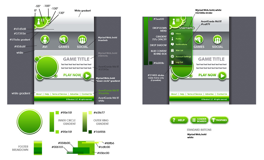
For some visual elements on the site, like the header, footer and many of the "bubbles" seen throughout, the developers wanted to draw these in code for faster loading times vs. using image files. So when it came time to make a master site guide for them, I made sure to include the necessary details to ensure accurate translation of the mockups.
Conclusion
All in all it was a great experience working with a new startup business and helping them create their identity from the ground up. While I very much appreciated the freedom and creative liberties I had with this project, at the end of the day my primary goal was to make something that not only looked great to them, but also best represented the company's vision for their platform and provided their future users a seamless, engaging experience. When I last followed up with Reveloot they said they were still working on developing the site, so I look forward to seeing the final product when it is finished and hope to hear some constructive feedback on my work.
All images © Reveloot LLC.
